Assignment One Contrasts
The starting point for this assignment is one of the most fundamental principles in design: contrast. Not contrast in the obvious photographic way which means the range of brightness which is just one of many different possibilities.
Freeman talks about contrasts in his book The Photographer’s Eye linking it back to the Bauhaus in Germany. It was a school of art, design and architecture founded in 1919 and has a major influence due to its experimental approach to the principles of design. A man called Johannes Bitten was in charge of the Basic Course at the Bauhaus and his theory of composition was completely based on the concept of contrast. Between dark and light, between shapes, colours and even sensations. This assignment is similar to one of the first exercises that Itten set the students, to discover and illustrate the different possibilities of contrast. Although the exercise was originally intended for art students it links smoothly into photography.
Freeman (2007:34) states ‘Itten’s intention was “to awaken a vital feeling for the subject through a personal observation.” And his exercise was a vehicle for plunging in and exploring the nature of design.’
Eight pairs of images were chosen from the following list;
| Large/small |
Long/short |
Thick/thin |
Black/white |
| Many/few |
Pointed/blunt |
Smooth/rough |
Still/moving |
| Transparent/opaque |
Liquid/solid |
Strong/weak |
High/low |
| Broad/narrow |
Light/dark |
Much/little |
Straight/curved |
| Diagonal/rounded |
Hard/soft |
Light/heavy |
Sweet/sour |
| Continuous/intermittent |
|
|
|
The idea is that the contrasts can be seen visually, for example we can look at a lead weight and know it’s heavy but how can the heaviness be displayed visually. Some of the contrasts leapt out of the list so I began with those.
My final list consisted of the following contrasts:
Large and small
Many and few
Transparent and opaque
Liquid and solid
Smooth and rough
Still and moving
Straight and curved
Thick and thin
The final photograph was required to show contrast in one picture and for this I chose pointed and blunt.
The final images
Many and few
Birds lend themselves to this contrast quite readily and although it is quite a common one I had the opportunity to photograph an annual event.

Many (f/5.6, 1/1000sec, ISO – 200, 85mm)
I was presented with this sight one morning just as I was about to go out for an early walk with the dogs. The telegraph poles were filled with swifts waiting to migrate at the end of the Summer, although I had never seen them group here before. The photograph reminded me of notes on a music score, I could have cropped the photo to show just the wires but I like the dark thickness of the telegraph pole on the right of the photo.
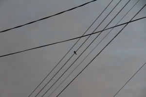
Few (f/5.6,1/125sec,ISO160, 85mm)
The following morning there was the one that got left behind. I zoomed in on the image so lost the telegraph pole on the right, in this photograph I wanted show the loneliness of the bird.
Large and Small
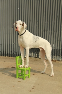
Large (f/5, 1/1250sec, ISO 100, 41mm)
During my time as a dog trainer I come across many different sizes of dogs so immediately I thought of including this contrast. I used the green chair as a constant size so the contrast could be seen. This is Ru a Great Dane posing outside the training barn.

Small (f/6.5, 1/80sec, ISO 100, 35mm)
Mia is a Miniature Schnauzer, looking back at these two photos I think the contrast would be better if they both had the same background, although the chair being a constant does show the difference in size, I also like the play on names two ‘Great’ and ‘Miniature’ although this does not add to the visual effect.
Transparent and Opaque

Transparent (f/5.6, 1/80sec, ISO 200, 53mm)
The word transparent immediately conjures up glass so for this image I found a window frame complete with glass that had been left behind when a garden hut was taken down, I moved it around in the garden taking photographs through it. I chose this image as there is a hint of a reflection which indicates to the eye that there is glass in the frame.

Opaque (f/2.8,1/100sec, ISO 800, 60mm)
The opposite of transparent is opaque and for this image I chose another window, this image was taken on a very cold morning and the ice had covered the windscreen of the car.
Liquid and Solid

Liquid (f/2.8, 1/80sec, ISO 320, 60mm)
This image was taken during the snowy weather using a macro lens, I was particularly fascinated by the water droplets as the snow began to thaw. I like the way the background is blurred making the leaves and droplets of the fir tree stand out.

Solid (f/2.8, 1/100 sec, ISO 200, 60mm)
Again using the macro lens to show the snow on the fir tree leaves, I like the way the ice and the snow are formed and the detail given.
Smooth and Rough
How to show smooth and rough in photographic form as the concept relies on the brain linking the visual image to a tactile one. I had various ideas for example smooth, polished wood compared to the rough bark of a tree. However in the bathroom I have a collection of shells and the light on the smooth shells caught my eye. I investigated further and took various images with both the kit and macro lenses until I decided on the following two photographs.

Smooth (f/2.8, 1/80sec, ISO 640, 60mm)
I used the macro lens to take both images but due to the nature of blurring I cropped the final image, I think the smoothness of the shells is indicated by how the light gives a hint of reflection on the largest shell. I am inexperienced at how to maximise light to enhance my photos but as this is the first assignment it is something I will return to as I progress with the course.

Rough (f/2.8, 1/80sec, ISO250, 60mm)
The ridges on the shells in this photograph suggest to the eye that they are rough, there is also very little reflected light compared to the smooth image.
Still and Moving
I had many ideas for this contrast, using the dogs to show movement, showing birds in flight, taking a photo with a blurring of the background when panning. In the end I settled on showing movement of the wind. During 2012 with the Jubilee and the Olympics, a number of residents in the village displayed Union Jacks on flag poles, I would pass this one every day on my walks and so I decided to use it as the image for still and moving.

Still (f/7.1, 1/200sec, ISO 100, 85mm)
In this image the flag is hanging limply against the flag pole indicating that the air around it is still.

Moving (f/9, 1/320 sec, ISO 100, 85mm)
In this photograph the flag is stretched out and the way the edges are furled over suggests to the eye that it is moving. On reflection both images would have looked better in portrait rather than landscape.
Straight and Curved
The idea for this contrasting pair came after the exercise that I undertook in Lincoln for the sequence of composition.
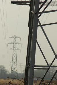
Straight (f/5.6, 1/800sec, ISO 100, 85mm)
I had noticed these electricity pylons at a distance so decided to take a closer look, I took various photos but like the comparison with the close up on the first pylon and then how the eye is drawn to the straight lines of the pylons in the distance, it was a misty day and I hope to revisit when the weather is better.

Curved (f/4, 1/1000sec, ISO 100, 17mm)
Keeping the theme of metal structure I like the way the sculpture uses curves as the figures stretch to reach each other over the river. Even the edges of the figures are not completely straight.
Thick and Thin
When I first saw this pair of contrasts I thought of a thick object and a thin object but I wanted to explore the concept further. I began to think of thick and thin liquids and how I could show the difference. I settled on dropping a strawberry into a bowl of thick yoghurt and then into a bowl of semi skimmed milk.

Thick (f/2.8, 1/500sec, ISO 3200, 60mm)
For this image I set the camera up on a tripod and used a fast shutter speed, it took a few goes before I got the timing right, dropping the strawberry with my left hand while I pressed the button with my right! As the strawberry lands in the yoghurt it is cushioned and the yoghurt forms a thick lip which folds over.

Thin (f/2.8, 1/250 sec, ISO 3200, 60mm)
I did experiment with both my lenses but liked the effect of the macro lens best for both photos, in this image as the strawberry lands it sends up a splash of milk and the bottom of the bowl can be seen. I feel that it indicates how thin the liquid is. I’m not happy with the lighting in the photo but could not seem to make it any better, another image to revisit as I become more experienced
Pointed and Blunt

Pointed and blunt (f/5, 1/1000 sec, ISO 100, 44mm)
The final photograph needed to show two contrasts in one, I thought about using an image I had taken of an icicle melting to show solid and liquid but in the end decided on the above photograph.
I like the way that the point of the clock tower is situated between the heads of the statue being the main ‘point’ in the image, the hands of the statues are blunt and the heads both have points also.
Reflection
The final part of the assignment is reflecting against the assessment criteria for the course. This can be found on page 10 of the course notes.
Demonstration of technical and visual skills
This includes materials, techniques, observational skills, visual awareness, design and compositional skills.
This assignment has helped in my familiarity with my equipment, I have used both my lenses (kit and macro), some images were taken using a tripod and some hand held. I have continued to explore exposure and shutter priority following on from the introductory exercises.
I have explored ideas before settling on my final images and I feel I have a better understanding of how changing position, lenses, shutter speed can affect the final image.
I feel my visual awareness has grown and I’ve put more thought into setting up an image and manipulating ‘props’ to achieve the final effect.
Quality of outcomes
This includes, content, application of knowledge, presentation of work in a coherent manner, discernment conceptualisation of thoughts, communication of ideas.
I have used the knowledge gained from the introduction and part one of the course to develop the assignment, I feel I have presented the photographs and descriptions clearly and in a coherent manner. I have tried to explain how I came up with the idea of the images and explain my ideas.
Demonstration of Creativity
The criteria for this section is imagination, experimentation, invention and development of a personal voice.
During this assignment I have advanced from taking photographs as they are presented to me to experimenting with ideas such as I did with ‘thick and thin’ and using the window frame for ‘transparent’. I am still unsure as to where I am heading with my personal voice as I am very early in my experiences as a photographer, I do have a feel for what I like to shoot and do tend to avoid certain areas for example images of people.
Context
Reflection, research, critical thinking.
This course so far has been a huge learning curve, not only becoming familiar with a DSL camera but also the technology needed to set up an online Learning Log. At first I became bogged down with technicality but have continued to add to my learning so that I am able to construct the learning log in a way that I am comfortable with and the reader is able to navigate it clearly. I am aware that I do need to spend more time on the background reading and integrating that into my learning log.
Bibliography
Cotton, Charlotte (2009). The Photograph as Contemporary Art (2nd revised ed), Thames and Hudson
Freeman, Michael, (2007). The Photographer’s Eye: Composition and Design for Better Digital Photos, The Ilex Press.
Hunter, Fil et al, (2009). Light: Science and Magic. An Introduction to Photographic Lighting, Focal Press.
Wells, Liz, (2009). Photography: A Critical Introduction (2nd edition), Routledge.


